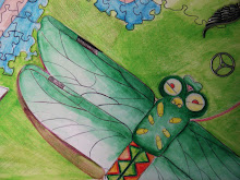
 i wanted emphasis on contrast in this piece, so i created the dream world in color and the reality in black and white. I tried to add an interesting effect with the under water city gradating into the classroom. wish i could have added more contrast in the black and white area, but overall I'm happy with the result.Oh and i used prisma markers, pencil, water color, pen, and (india ink to make it shiny!!!1!)
I like that you decided to work in black and white as well as color in this piece. I also like how the imaginary background blends into an urban background for the classroom. I do think this piece lacks the level of detail and intensity of color that your other pieces have but working back into the piece in areas like the water, the green road, or the gray castle would add more depth to the work.
ReplyDeleteI like this piece sarah! It is not you best, in my opinion, but i think that the depth of the image and the contrast between reality and fiction is great. Keep up the good work.
ReplyDeleteI love this idea of this piece and the underwater theme. I like a lot of what you have done, but I feel you could continue it. Like others have said, more contrast and value could definietly help. If you could somehow make the trasition from the underwater world to the classroom a little less drastic, maybe gradually morph the two, I think it would work out really well. By the way- the lightened version that you added at the top is a MUCH better image than the second. Good editing and a good piece :)
ReplyDeleteKeep it up
i think you did a really good job here sarah! i like how you didn't make the colors too bright like in some of your other pieces. I think that maybe the transition from the classroom to the blue part of the ocean could be a little smoother though! good job!
ReplyDeleteSarah, I think that you are getting stronger with your pieces. Although I like this one, I don't think it's your strongest one. I think you can add some depth to the background. I think you can also work on having a better transition from the water to the classroom. Overall, great job!
ReplyDeleteSarah- good work. I would like to see you draw back into the castle and the water and add depth in terms of intensity of color and layering of marks. The concept behind the artwork is strong and you continue to improve in your illustration style and emerging voice!
ReplyDelete