 WootnessXD I'm done! ok last concentration i spent two weeks on this sucker. so it better be good. I was originally going to have the girl putting the puzzle together. but the idea evolved and this was the result. the puzzle part didn't actually take to long after my experience with puzzle pieces in my last work I've kinda got the hang it. all the objects on the ground are objects from my room except the pink dress(but i do have fairy wings) a couple of the pieces weren't working for me so i cut them out and redrew some things but all in all I'm happy. Now back to sleep......i mean work.....
Starving Artist
- Sarah. C. Harrell
- I'm a senior in highschool with an unhealthy love for illustration and comic books. My ispiration comes from surrealism, but lately my interests in psychology and art therapy have been a raging force in the subject matter of my work.
Monday, December 21, 2009
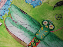
concentration #12
WootnessXD I'm done! ok last concentration i spent two weeks on this sucker. so it better be good. I was originally going to have the girl putting the puzzle together. but the idea evolved and this was the result. the puzzle part didn't actually take to long after my experience with puzzle pieces in my last work I've kinda got the hang it. all the objects on the ground are objects from my room except the pink dress(but i do have fairy wings) a couple of the pieces weren't working for me so i cut them out and redrew some things but all in all I'm happy. Now back to sleep......i mean work.....Tuesday, December 8, 2009
concentration #11
 This image is a lot bigger than what I'm used to. I had the idea for something like this for awhile now. I really wanted to concentrate on transformation of the imagination. Instead of using my regular watercolors i used markers and other types of paint. I tried to make the colors softer and the lines crisp. I still don't know about the castle or that white space that's really bugging me but this is probably my best piece.
Friday, November 20, 2009
concentration #10
 I wanted to go bigger with my concentration and with the layout of the picture i think it worked out nicely. I used a gradation of color (from blue to black) just to ease into the night sky rather than having it change immediately. the sun is the light bulb, which needs to change because it doesn't look like a sun at all. I have to fix some proportional stuff, but all in all I like the outer space ceiling. I also believe that the character stands out well for the first time.
Tuesday, November 17, 2009
Concentration #9
 I tried more than ever to apply perspective for the city scape. I also tried to give a feeling of depth by putting in a floating car and bridges that overlap one another. The color scheme for the city was ment to create a sense of hight and the feeling of shrinking. I'm not very happy with the left portion of this piece manily because it makes both sides apper dream like when one of them has to real.
Tuesday, November 10, 2009
concentration #8
 In this piece i tried to create this sense of space and contrast by cutting up the original then gluing it to a black paper. By using actual chalk I wanted to create contrast between the water colored pieces and the chalk illustrations. you really can't tell in the picture but the butterflies and some of the swirls are stuck on 3-d Os. I think the chalk part could have turned out a little better, but overall I'm happy with it.
Thursday, November 5, 2009
concentration 7

Ok the top blue butterfly somw how fell off and ended up on sargentas wheel painting!(go check it out) any way i with the butterflies i wanted to craete a gradation of size rather than color to give this sense their coming off the page. some how I need to draken the back ground because it doesn't really stand out that well. Hopefuly I test new perspectives in the future.
Friday, October 30, 2009
concentration #6
 this piece has three layers of paper each cut out separately and then pasted together to create the overall picture. i tried to make the blocks and the great wall the brightest and most intense objects in the piece. i dulled down the color of the walls from yellow to blue so it wouldn't compete with the other half of the drawing. i tried to make the little girl pop out more so she wouldn't fade into the back ground. I tried to blend the window in to the sky to make the transistion more natural from reality to fantsy.
Saturday, October 17, 2009
concentration #5

 i wanted emphasis on contrast in this piece, so i created the dream world in color and the reality in black and white. I tried to add an interesting effect with the under water city gradating into the classroom. wish i could have added more contrast in the black and white area, but overall I'm happy with the result.Oh and i used prisma markers, pencil, water color, pen, and (india ink to make it shiny!!!1!)
Friday, October 2, 2009
Concentration #4

Shes at school, but dreams of freedom away from her boring routine.I tried to incorporate repetition of structure with the bricks that repeat through out the painting. I used the same processes with the side walk as it gradates into the back ground. By creating a stark contrast between the two spaces by using different temperatures in color. PS. I used Sara Argenta as my model.
Thursday, September 24, 2009
concentration 3
 In this children's story book i tried to balance out the book by putting to images on either side of the castle. though the fairy is a bit small compared to the rose i think it turned out all right. I added massive shading to the interior and exterior of the book so it gives a popping effect to the 3d look i was going for. I do believe this reflects a childs imagination through the elements of art. by making each piece a cut out and forcing it off the page i think i achieved that effect.
Monday, September 21, 2009
Concentration 2

As his young imagination sores you can see it being reflected in the Book store window as he takes flight along side old world war 2 fighter jets. I tried to incorperate heavy shadows into the clouds and give the apperence of explotions. the chaos does tend to draw attention away from the center plane with the kid in it. I put the awning in so it appered to be a window.
Friday, September 11, 2009
#1
 the first piece in my concentration shows what happens when you don't pay attention to your work. It eats you.......well in this case I just wanted to illustrate artists interacting with their work on a more fanatical level. I used water color pencils,water colors, and ink to make this work "pop" out a little more.
Thursday, September 10, 2009


Tuesday, September 1, 2009
Dreams
Belief. In exploring the human mind I decided to study dreams and delusions. Something the human mind conjures up when our minds are shut down in sleep. I'll illustrate these dreams in water color. The possibilities are endless with this subject, but in this case I want to narrow it down to fantasies becoming a reality. That we might see our own creations come to life in our day-to day activity.
Sunday, May 24, 2009


Tuesday, May 12, 2009
Final Gun Cross
 this is my final silkscreen. I used repeteition of the cross for effect and inverse colors every other cross. the design puts two flags together so the words are unreadable. The blue matte board matched the ink color so i used it to give the crosses a strong support because the cross was to weak. I think this represents our modern day society with the concept that violence and guns in video games and movies are over used and cause our minds to be desensitized to that kind of thing.
Monday, May 11, 2009

Friday, May 8, 2009
BANG
 The first try at creating a silkscreen image was with this picture i created in photoshop. The image evolved over time and became a little more complex.
Toy gun
 This print was my first after a long trail and error with my screen. I like the placement of the guns because it makes them apper toy like. the contrasting colors help the effect. I tried to make it seem as harmless as possible even though thoese are guns.
Wednesday, May 6, 2009
SilkScreen Madness
well more than some have damaged their screen or have had to completely redo them (i being one them) honestly it's a frustrating processes that i don't want to repeat a fifth time.
Subscribe to:
Comments (Atom)