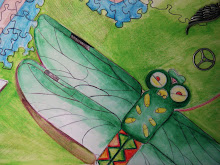
Ok the top blue butterfly somw how fell off and ended up on sargentas wheel painting!(go check it out) any way i with the butterflies i wanted to craete a gradation of size rather than color to give this sense their coming off the page. some how I need to draken the back ground because it doesn't really stand out that well. Hopefuly I test new perspectives in the future.

Sarah,
ReplyDeleteI think that this piece is interesting but it seems like you are repeating a lot. I mean that even though I like your butterflys, I think that you make too many of them. I do like this picture with the butterflys because it goes well with what you are trying to show but next time, lay low with the butterflys. You did well though!
Sarah - nice work. Your illustration style shows improvement in this piece and your vision is communicated clearly. I would recommend that you work back into the artwork slightly to redraw and define edges. But, overall, this is nicely done!
ReplyDelete