 In this piece i tried to create this sense of space and contrast by cutting up the original then gluing it to a black paper. By using actual chalk I wanted to create contrast between the water colored pieces and the chalk illustrations. you really can't tell in the picture but the butterflies and some of the swirls are stuck on 3-d Os. I think the chalk part could have turned out a little better, but overall I'm happy with it.
Starving Artist
- Sarah. C. Harrell
- I'm a senior in highschool with an unhealthy love for illustration and comic books. My ispiration comes from surrealism, but lately my interests in psychology and art therapy have been a raging force in the subject matter of my work.
Tuesday, November 10, 2009
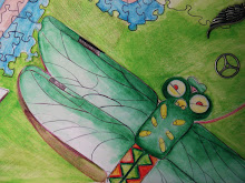
concentration #8
In this piece i tried to create this sense of space and contrast by cutting up the original then gluing it to a black paper. By using actual chalk I wanted to create contrast between the water colored pieces and the chalk illustrations. you really can't tell in the picture but the butterflies and some of the swirls are stuck on 3-d Os. I think the chalk part could have turned out a little better, but overall I'm happy with it.
Subscribe to:
Post Comments (Atom)
This piece definitely required taking some risks Sarah, and I'm glad you did! It looks really cool. It takes guts to cut up some of your artwork and turn it into something new. Plus, the experimentation with a different medium (the chalk) also required you to take a risk. Ultimately, your risks paid off because they resulted in an interesting and engaging piece with a wide range of values. The black paper gives the piece a entire new dimension and really makes the lighter, softer images pop. Really good job sarah, I like where you are going with your concentration :)
ReplyDeletethis is a good idea as a way to continue your concentration. I like the composition and i think it works well to lead the viewers eye around the page. I would suggest building up the background a little more and adding some value to the castle to make it look more realistic.
ReplyDeleteSarah-I like this one. I feel like you took your concept of entering into a dream world a step further by cutting up your original piece and adding stuff in chalk. I like the black background because it relieves the intensity of colors you've been doing with the watercolor. I feel like some of the chalk drawings look a little underdeveloped..plus the stairway behind her still looks like a ladder to me (haha sorry). Overall, I like your risk-taking in this one!
ReplyDeleteSarah- well done. I agree with the comments above that you have excellent risk-taking and a stronger development of your idea. I would redraw back into the chalk and the dragon to create greater contrast and layer more mark-making.
ReplyDelete