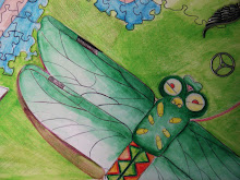
 In the very beginning I had only a picture and tracing paper which then turned into a stencil, however the plain black and white contrast and clean edges gave no energy or sense of insanity. During the critique there were several ideas thrown out for consideration, three of which I tried, but once I started the scratch board there was really no stoping. By applying crayon to illustration board I then painted over it with india ink and let it dry. With this being my first piece I wanted to convey that I had grown as an artist and hopefully my last piece will show even more growth. I'm glad I've found a concentration I enjoy researching even though the statement needs fine tunning.
Starving Artist

- Sarah. C. Harrell
- I'm a senior in highschool with an unhealthy love for illustration and comic books. My ispiration comes from surrealism, but lately my interests in psychology and art therapy have been a raging force in the subject matter of my work.
Friday, September 24, 2010
Concentration #1
 In the very beginning I had only a picture and tracing paper which then turned into a stencil, however the plain black and white contrast and clean edges gave no energy or sense of insanity. During the critique there were several ideas thrown out for consideration, three of which I tried, but once I started the scratch board there was really no stoping. By applying crayon to illustration board I then painted over it with india ink and let it dry. With this being my first piece I wanted to convey that I had grown as an artist and hopefully my last piece will show even more growth. I'm glad I've found a concentration I enjoy researching even though the statement needs fine tunning.
Subscribe to:
Post Comments (Atom)
I really like the color scheme of this piece, especially the red shade in the face and hands. The bright vivid colors convey the feeling of insanity really well, as does the deterioration of the figure down into shapes at the bottom of the picture. I love the idea of the person kind of falling apart. I do think it would be cool if the area in the top left corner was really black to increase the contrast, but its awesome the way it is too.
ReplyDeleteSarah- This is a dramatic departure from last year. I love it! I would want to see you develop the hair more as shape so that there is more unity to the bottom design in your work. Otherwise, you handled the medium well and there is a sense of an emerging voice in your work. Good job!
ReplyDeleteSarah I really like your experamintation in this piece. I'm glad you tried scratch board and I think it will add some great diversityj to your concentration. My only constructive critizm I think I can give to add to this piece would be to clean up the black area a bit and be careful when taking your picture so you don't get accedental space on the sides.
ReplyDelete