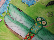
 Inspired by art nova I wanted this self portrait to have movement and a strong design. I have a strong feeling that the neck will be fixed in Photoshop since its become resilient to my markers. Looking at it now there are details I'll need to fix, but for now I like the gesture and shading.
Starving Artist

- Sarah. C. Harrell
- I'm a senior in highschool with an unhealthy love for illustration and comic books. My ispiration comes from surrealism, but lately my interests in psychology and art therapy have been a raging force in the subject matter of my work.
Friday, February 4, 2011
Breath #1
 Inspired by art nova I wanted this self portrait to have movement and a strong design. I have a strong feeling that the neck will be fixed in Photoshop since its become resilient to my markers. Looking at it now there are details I'll need to fix, but for now I like the gesture and shading.
Subscribe to:
Post Comments (Atom)
I agree with you that it would look good to soften the edges of the shadow on your neck. I like the contrast between your cheek and the background, but I think the top of your hair could be a little darker for more contrast with your face and the background. I really like the pattern in the bottom of your hair, and your color scheme is really good. Also, I think you did a good job of conveying smugness.
ReplyDeleteSarah- I like the start to this portrait and composition and the influence of Art Nouveau. I think there are two things that you can focus on at this point - 1) Because it is hard to control the marker on a smooth foam core surface, perhaps you would consider painting on top of this and creating more of a mixed media piece? I could see this being developed further in the background to carry out some more of the design work with perhaps paint to smooth your lines over? 2) If you look at the shadows on the right hand side of your face and your right arm, they are blue. I think if you match it on your neck and eliminate some of the green, the shadow on your neck will not feel so out-of-place. In portrait work, you want to create shadows using the complement of the face color, so in this case it would be more of a blue.
ReplyDeletethis looks really good sarah and a lot like you! maybe work on blending the shading under the neck a little bit into the rest of the body?
ReplyDelete